On Compositional Window Management
11 February 2023
As someone interested in providing more agency in our computing environment I am on the lookout for pieces of our current computing environments that can be enriched to provide a more malleable experience. Window management is an area that I keep coming back to given how prevalent the domain is. I will provide a recap of what window management is, how it’s used today, and how modern applications have evolved to deal with current deficiencies. Then I’ll provide a compositional approach for window management to move towards and discuss how I think this could make applications more malleable.
Where we’re at
Window management is one of the least valued categories of software given how heavily used it is. Window managers control what is visible when you use a computer, yet in most cases they are inflexible and extremely limited in the scope for which they operate, relinquishing their responsibility to domain-specific applications causing a fragmented experience. I believe that we can do much better, and that composition is a critical component to improve.
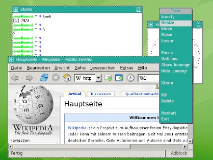
Windows are the graphical containers provided by operating systems for end-user applications to embed themselves. In some sense, windows are the fundamental building block of the desktop operating system; without windows, every application would be in charge of the full rendering of the desktop and you could only use one application at a time. Mobile operating systems, such as Android and iOS have also been heavily motivated by the window metaphor, even if you don’t usually see many windows on the screen simultaneously the interactions that the OS provides show “apps” in self-contained usually rectangular GUI layouts meant to resemble windows of the desktop.
The window manager is a critical component of the operating system that controls the placement and organization of windows on the screen. The most common type of window manager is the floating window manager, which allows multiple windows to be displayed on the screen simultaneously as freeform rectangles that can be moved or resized within a fixed-size 2D canvas. This is the type of window manager used in traditional desktop environments such as Microsoft Windows, macOS, GNOME, and KDE. Floating window managers provide users with a range of customization options, including the ability to arrange windows in semantically meaningful positions, resize windows to fit content or reflect relative importance, and overlap windows to allow for shifting focus while maintaining peripheral awareness.
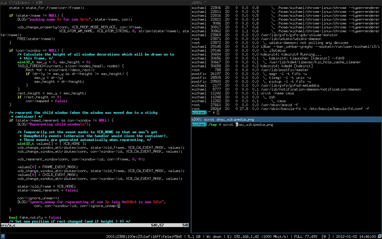
Tiling window managers are another form of window management that’s quite common. Some examples of popular tiling window managers are i3, bspwm, xmonad, and awesome. The main idea behind tiling window managers is that the windows should take up the entire available screen without overlapping. This is accomplished by arranging windows into several “tiles” that fill up to represent the entire screen while not requiring users to manually resize or rearrange windows to maximize screen space as they would in a floating window manager. These tiles can still be rearranged or resized but the remaining tiles automatically reflow around to continue maximizing space. Power users will note that all of the major desktop environments mentioned above have added some form of tiling to their floating window managers; for example, Microsoft Windows supports splitting the desktop into two applications by dragging to the left or right side and macOS supports a side-by-side view for full-screen applications.
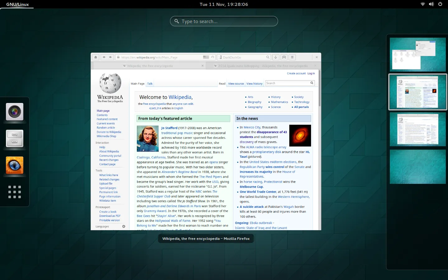
Another way in which existing window managers have evolved is the introduction of Virtual Desktops. Virtual desktops introduce copies of the traditional desktop metaphor so that users can switch between multiple desktops while maintaining window layouts and states when working on different tasks. I’m glad to see that some effort is happening in this space. Still, I can’t help but think window management is just an afterthought in the Operating System and is not considered a primary part of the interface open for exploration.
Leave it up to the application
Given the lack of extensibility or capability in the operating system’s window management, end-user applications have gone through the effort to implement their own forms of window management. The most obvious example is tabs. Web browsers, modern IDEs, and text editors almost universally support tabs; Even Windows file explorer is getting tabs. Tabs are a great interface feature that allows users to switch between panes quickly while taking up very little room. Once you begin looking for tabs you see them show up in all sorts of forms in many different applications. Instant messaging apps such as Slack, Discord, or Element use horizontal tabs to separate different channels of communication. Email applications often separate inboxes by tabs.

Since tabs are not provided as an operating system or window management feature, all of these applications are forced to write their own distinct version. This creates more work for the application developers, forces inconsistencies in the interfaces, and most importantly breaks interoperability. It would be perfectly reasonable to want a window with tabs for PDFs, images, and rich document files. Still, you would be forced to open them in a single application that supports all the file types and implemented tabbing. The most common solution to this problem is to just use web apps and recover tabbing by using browser tabs. This is really just giving up and allowing for rich tabs to be a web-only feature; we should be able to utilize tabs for any application and combine tabs between them.
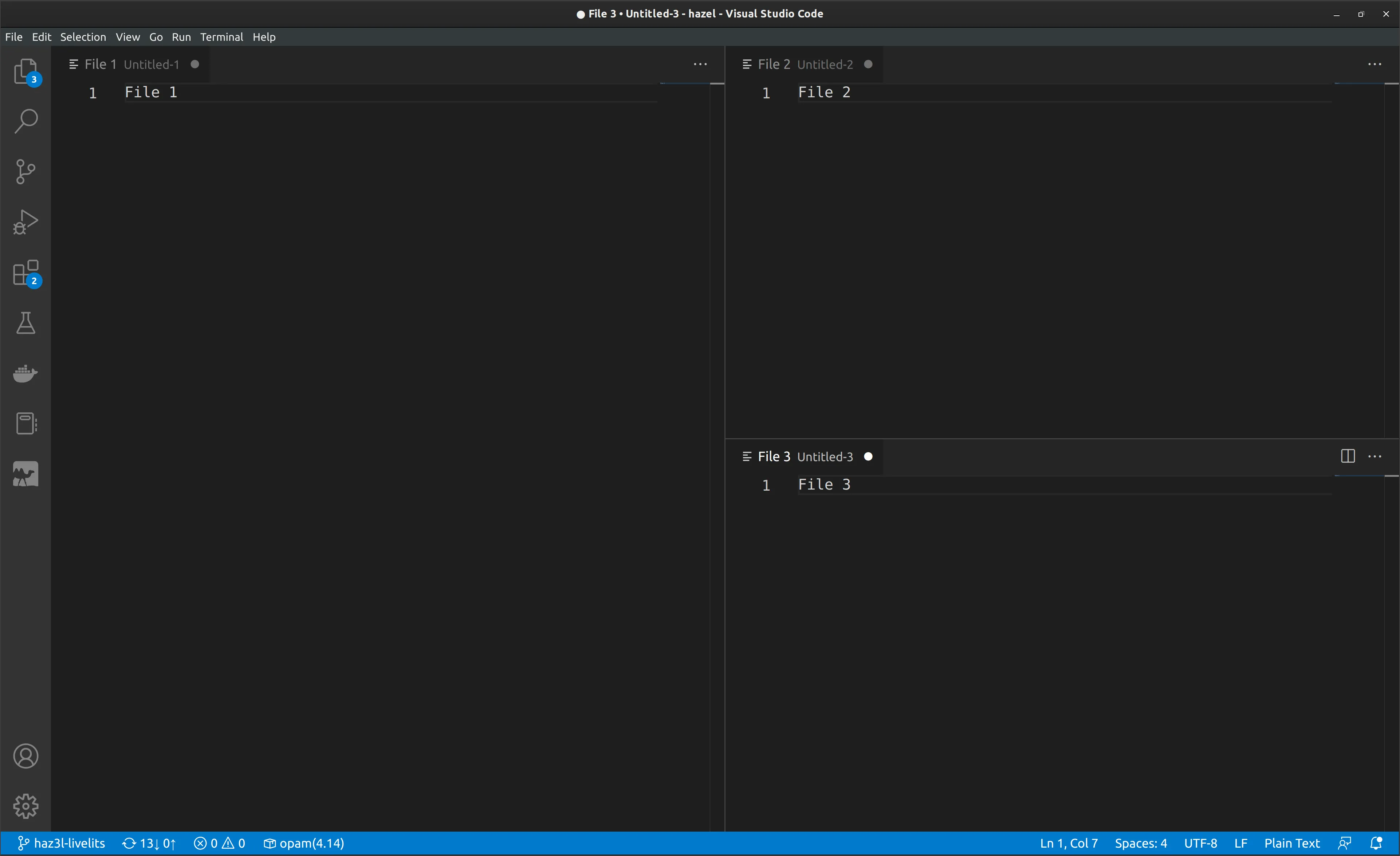
Terminal text editors like Emacs and Vim have long supported split windows in order to access multiple buffers on screen at once. Modern IDEs, such as VS Code, have continued this feature allowing for a single editing pane to be split horizontally or vertically. This in-app windowing functionality is eerily familiar to the tiling window managers that were discussed above. The only difference is this is done within the context of a single application window. Unfortunately, similar to tabs, they also suffer from non-interoperability**. Another unfortunate side effect of implementing the tiling internal to the application is that now users have to learn a distinct set of keyboard shortcuts and interactions to manage the windows or splits**.
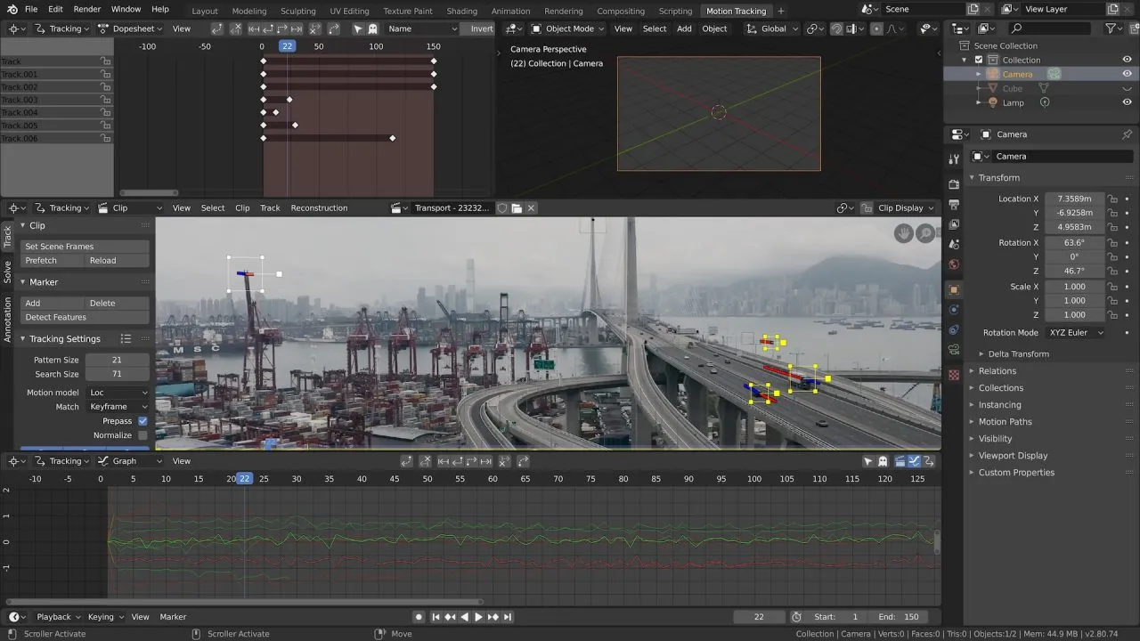
Professional media creation applications have been implementing their own window management for years. Tools like Photoshop, DaVinci Resolve, and Blender have many panels that can be visible on the screen at once. Their internal window managers support features such as docking onto sidebars, tabs, and even floating panels. Given that these tools are aimed at professional use they can be more difficult for novice users. The sophistication of these tools may seem cluttered or unnecessary, but they have given great power and agency to power users to customize their workspaces to their benefit. I would like to imagine a world where all kinds of workflows could benefit from these docking/panel interfaces. Instead of browser extensions being locked into the bookmark bar if they could be given panels that could be docked on the sides of the browser.
I wish there was an option for desktop WMs to be infinite canvas. All the WM features need to nest though to feel really good.
— Alexander Bandukwala (@abanduk) November 23, 2022
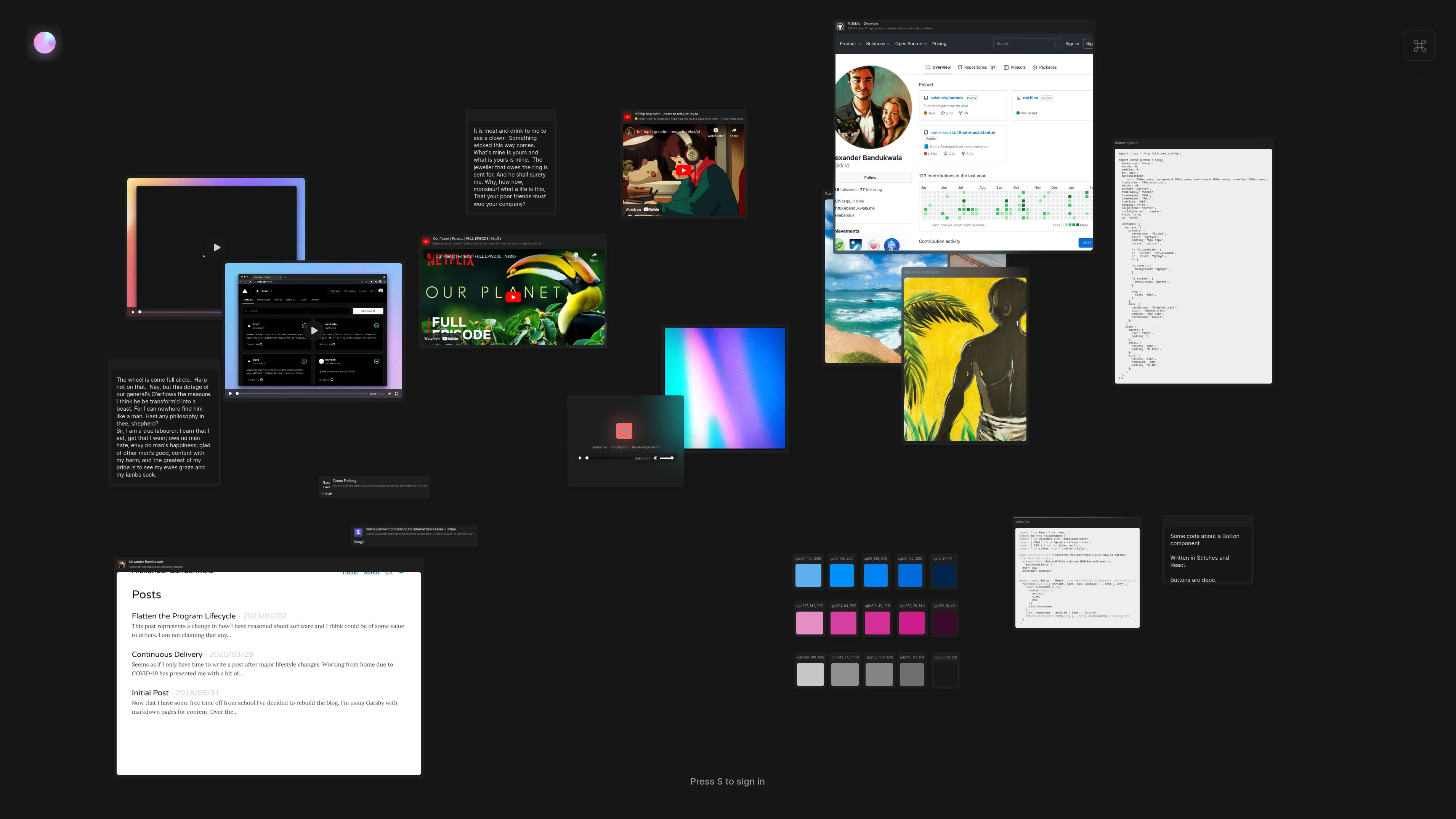
The last example of in-app window management may be slightly counterintuitive. Infinite canvases have been taking off in recent years with applications such as Muse, Miro, and Apple’s Freeform. An infinite canvas application can be thought of as an arbitrarily large whiteboard space that allows you to represent content spatially. Usually, this involves a drag-and-drop interface often accompanied by some drawing and text functionality. This should seem familiar since it’s very similar to the floating window managers mentioned above. Both are attempting to allow users to layout their work arbitrarily in 2D space by resizing and drag-and-drop. Infinite canvases however have a much more expansive feature set given that the canvas extends infinitely in every direction; plus they allow users to zoom in and out to assist in navigation. Desktop floating window managers should adopt these features allowing users to have many floating windows open without having to fit them all on their limited screen space. Instead, you can just arrange your open windows in an infinite 2D space and zoom around as needed. I can imagine a workflow where personal tasks are located in a topographical region distant from work tasks, so at the end of the workday, a user could shift their focus from work to personal use. In addition, there’s no reason the desktop window manager couldn’t allow for arbitrary drawing/text alongside traditional application windows. Even if not intended to be a desktop window manager I think Ultra, a multi-media canvas, can give a glimpse of the feeling a more infinite floating window manager would provide.
Composition
My biggest critique of traditional window managers is their lack of composition. Composition allows for building something out of constituent components. Window managers today are built with predetermined workflows and do not allow for arbitrary recombination.
I would like to put forward a new view on window management. Instead of window managers providing a preset window managing layout, they should ship a variety of window managing containers that allow for arbitrary nesting and reuse. An example under this system could be a top-level default desktop made up of a tabbed layout, where each tab represents a different persona, such as work, play, social, etc, then each of those tabs could have layouts more carefully curated to their specific use-case. The Work tab could be configured in a predefined tiling layout, Play could be a floating infinite canvas to incentivize the idea of exploration and creativity, and Social could be represented as a timeline. Then because we can compose all the way down, inside the Work tiling layout you could have a project tracker pane that had a tab for each project allowing you to easily drill down into the details of a particular project.
Alternatively, another user may choose to keep their top-level container as an infinite canvas, then have many other windows on the canvas that each has their own configurations. If the user was a software developer for example they could have a single split window for source code and the running application which lived somewhere in the infinite canvas near the project requirements and surrounding context.
The following are some ideas for containers that should be available in such a system:
Tabbed Window
A window with named tabs that change which inner window is being displayed
Split Windows/Tiling
A window composed of 2 or more sub-windows arranged in a tiling fashion.
Infinite Canvas
The infinite replacement of our traditional floating window manager with the addition of drawing and text overlaying the canvas
Fixed-size Canvas
There’s still value in a canvas you don’t have to traverse so you would still offer a floating window manager fixed to the screen size.
Grid or gallery view
Similar to tiling but windows are represented in consistent rows/columns
Panel and docking bars
A container that adds a panel bar so that windows can be docked inside the panel and hidden away if needed.
Document view
A more outlandish option would be a document view where the window would represent something akin to a linearized document like Notion or Google Docs. Sub-windows would behave similarly to inline blocks or images in a text document. You could write an essay and have a fully featured application inline the document. This would unlock a new sort of literate computing environment.
These suggestions are just a starting point. In an idealized system, new containers would be easy to add extending the system as needed. The main idea is that the window manager should be thought of as decomposing windows into sub-windows as opposed to being a single fixed layer.
Down into the applications
The suggestions above would help with organizing application windows significantly, yet it would not do much to help with intra-application concerns. As discussed above, applications can have very rich internal window managers: e.g. Photoshop and its tool panels. We would like for them to be able to adopt the operating system’s window management features listed above, but It’s too large of a lift to break these tools into separate applications in order for them to adopt the operating system’s window manager.
Instead, the operating system’s window manager APIs should be rich enough for applications to describe these multi-window arrangements. This on its own is not a novel concept; GIMP has had a multi-window interface for years. One issue with the older multi-window interfaces is that since windows could not compose and the built-in window management features were so meager, users would have to be very careful to manage the windows themselves. This is what led to the applications reimplementing their own WM features internally.
What we would like is for the operating system to provide APIs allowing for applications to describe their semantic structure and default window layout, and then represent this to the user using the system-wide window controls. This would allow for a form of deep embedding of the software into the operating system which would feel both more intuitive while also being more powerful. Using the native window management features would be an easier experience for users because there would be less context switching between applications, e.g., you’d no longer have to remember how tabs or window splitting worked on an app-by-app basis. It would then be more powerful because you’d get interoperability between the windows from different applications. Additionally, there would be richer features available since you’re not restricted to the set of WM features the application designer provided.
Doesn’t homogeneity cause stagnation
The most obvious criticism of such a vision is that using a singular WM across all of the computing experience would result in a lack of competition and stagnation in the space. After all, in some sense, that’s what has already happened and has caused the proliferation of competition in applications.
However, there’s no reason for the space to be static. The operating system could allow for new containers or WM features to be installed, causing a marketplace for WM features. I believe this would cause even more innovation in the space since those improving window management don’t also have to be working in the context of a single application.
Applications that have a very unique use case, could even ship their own containers, which if conforming to the operating system APIs would preserve all the power/interop while allowing for the necessary customization.
Overall I feel like the current state is stagnant enough I’m not overly concerned with making it worse.
Persistence
Another advantage that web browsers have over the traditional desktop operating system is persistence. In general, if you reboot your system and open your web browser you’d expect for all your tabs to remain in a similar order. You may be logged out of some websites and some temporary data lost, but the overall state of your environment is recoverable.
In traditional desktops after a reboot most of the window state is lost and irrecoverable. OS X has begun reopening applications on reboot, and even attempting to reconstruct some window positioning. But given that desktop applications don’t have URLs the specific application state is usually lost.
I have many more thoughts on application persistence, so I’ll be saving them for a more in-depth future post.
Conclusion
Hopefully, I’ve expressed how important the domain of window management is, in that it is pervasive in computer usage overall. The existing tools mentioned above have provided many great ideas and utility, but the lack of flexibility in the space has caused real problems. As mentioned, application developers have had to extend into the domain causing both increased engineering effort as well as suboptimal user experiences. Composing window managers as a solution would help alleviate many problems while allowing for innovation in the design space. This rich window management toolkit would also allow for deeper embedding into applications allowing for better inter-application organization and a more malleable computing interface.
Further Reading
This is a concept I’ve been ideating on for a long time. Probably since I first used GIMP and multiple monitors back in 2007. There have been a few places of inspiration that have helped me refine my thinking in the area that I think would be useful for anyone interested:
Smalltalk/MVC
Smalltalk and the people at Xerox PARC invented windows and the WIMP (windows, icons, mouse, pointer) interface. Reading about and observing the usage of older Smalltalk systems has given me the perspective that applications would use windowing much more than today.
MVC (model-view-controller) is a software architectural pattern, not coincidentally, also developed at PARC. With MVC you’re allowed to have separate views over the same data (model) which is what originally got me to think about window managers as just separate views into the same content.
Alexander Obenauer
Alexander is an independent researcher looking into the “operating system of the future”. His lab notes on views are very related to the above topic. His overall vision is more all-encompassing than the one I’ve put forth and I would implore everyone to read his labnotes.
Comments
Join the conversation by replying on Bluesky.